Showing posts with label sketch. Show all posts

Wednesday, August 03, 2022

Back to Basics


Garden Bounty

A garden harvest!

Summer is flying past and it's shaping up to be a busy fall with upcoming art shows. I'm excited! But sometimes I can get a little overwhelmed with all of the things that I need to do. When I start to feel lost, I reel myself back in through a couple of means. 

The first is my garden. Thanks to my parents, I've always had a garden of some sort since childhood. Sometimes it was a modest set up, such as pots on my apartment balcony in Wisconsin or a shared community garden plot in Maryland. Now, I'm pleased to have a wonderful backyard oasis in Knoxville, Tennessee. The photo above shows a recent harvest. We have massive fig trees and all of the flowers you see pictured I started from seed in our basement back in March. 

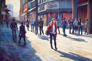
The other way I marshal myself during busy times is by getting "back to basics" with my work. Nothing grounds me and calms me more than picking up a stick of charcoal and working out my ideas with some inexpensive newsprint paper. It's very freeing and I find that it makes it easier for me to tackle more complicated ideas, such as this recent cityscape, "Focus!"

Focus!
30 x 40 inch oil on canvas

I had this idea from an outing to New York City for quite a while, but I needed to mull it over before I dove into it because of the subtleties of light and shadow. The best way for me to "break the glass" on this motif was to begin with vine charcoal sketches. Shown here are a couple of the initial sketches I made to map out this idea in my mind before taking up a paintbrush. 


I also like to use color maps to envision the overall values before I start mixing up paint. Shown below is the small map that I used to guide me throughout the creation of this painting. 

Color Map

Once I have these details set in my mind's eye, I'm ready to jump into the actual painting. And a great representational painting always has an abstract foundation, as you can see here in this video clip: The Initial Block-In

Thanks to my garden and some sticks of charcoal, I'm able to juggle quite a bit during a busy time. Sometimes, getting back to basics is a good thing!


Monday, January 18, 2021

Back to Black (and white)

 
The Center City skyline of downtown Philadelphia
as viewed from a spectacular urban rooftop garden


I'm listening to AC / DC’s hit "Back in Black" as I write this because it's the perfect theme song for what I’m working on right now. During these winter months when I'm not exhibiting at outdoor art shows (and especially during a time of pandemic), I use this quieter time to work on custom painting commissions for clients.


Among a few projects that I have in process right now is a custom cityscape painting that will feature the Center City skyline of downtown Philadelphia. There are many factors to consider in a subject so complex, everything from light and atmosphere to the details of the architecture. To keep an idea like this from becoming overwhelming, I go back to basics and go "back to black." Gosh, it's almost a perfect title to pair with AC / DC, right? 


An alternative perspective of the subject  
 
What I mean by this is that I strip down the idea to graphite renderings in my sketchbook to work out the composition and approach. This is just a first building block. In the coming weeks, I’ll do a couple of small scale color studies for my client to review. As the old saying goes, a picture is worth a thousand words, and these first practice runs at an idea allow me to communicate what I’m thinking to my client and also help him offer his thoughts and ideas during the process. 


There’s nothing wrong with going "back to black" to create a full-color painting!

Saturday, May 21, 2016

Shorthand

Uff dah. It's been a while since I posted to this blog. In an era of online social media, we artists have to wear a lot of hats between web sites, blogs, Facebook, Instagram, Twitter, and more. Earlier this year, I finally jumped into the year 2010 by creating an Instagram presence (@sarahpollockstudio) and I've actually been pretty good about keeping that up-to-date. In fact, if you're looking for the first dibs on my new pieces, Instagram is a great way to peek in at what I'm working on in my studio.

Anyways, rather than talking about my art online, I've been making it in my studio. I've been busy getting ready for my first art show of the season, the Rittenhouse Square Fine Art Show in Philadelphia. I'll exhibit my new pastel works at this event during the weekend of June 3-5, 2016, and I recently finished several new pieces in preparation for the show. In this post, I wanted to share a little more with you about the process behind some of these new pieces.

Color motivates my choice of subjects. After more than a decade of working in the pastel medium, I've found a process that allows me to quickly evaluate whether an idea will work successfully. I call it my shorthand, in honor of my Mom who had to learn actual shorthand in high school. Indeed, her first job was as a corporate secretary for a company in Milwaukee, Wisconsin. All these decades later, when she and I go to the Philadelphia Flower Show each spring, I still catch her writing in a small notepad using shorthand as she jots down ideas and inspiration.

Initial Shorthand for "Please Continue to Pull Forward," an eventual 12 x 24 pastel.

Final Piece: Please Continue to Pull Forward, 12 x 24 pastel.

My "shorthand" is a series of small color studies, some of which I've shared here. I learned this approach from Doug Dawson, a wonderful pastel artist and an outstanding teacher. He emphasized the importance of selecting just the most essential colors and values to convey a composition. And then sticking to them for as long as possible. Eliminate the superfluous and stay with the most essential ingredients.

In these initial studies, I think you'll see how just these tiny dabbles of thinking and planning link to the final, polished piece. Enjoy!

Initial Shorthand for "July Coda," an eventual 16 x 24 pastel.

Final Piece: July Coda, 16 x 24 pastel.


Initial Shorthand for "Capture," an eventual 12 x 18 pastel.

Final Piece: Capture, 12 x 18 pastel.

Thursday, May 01, 2014

From Concept to Creation

When I first began my art career, I would get so excited about the things I saw that I couldn’t wait to start painting them. Problem was, however, that I’d often get to the middle of a piece and then get lost. And then, I shall neither confirm nor deny, there was a temper tantrum and the whole piece ended up in the proverbial “vertical file.”

I finally cured myself of this irrational exuberance (thank you for that priceless phrase, Mr. Greenspan) by disciplining myself to do initial studies. This is something that I preach to my students whenever I teach at the Art Alliance of Central Pennsylvania, because I see the same impatience in many of them. It’s understandable. There are so many things out there competing for our attention, and it’s only natural to want to rush home to one’s studio and dive right in.

A peek into one of my sketchbooks showing an initial black and white value study for Against the Tide

But over the years, these initial studies have really helped me to strengthen my compositional skills and to understand WHY I am choosing a particular subject. And the studies don’t have to be any massive investment of time. As you can see here, quick, perfunctory sketches are sometimes all that’s required to get a concept imprinted into one’s mind.

A final iteration of the value study where I refined and finalized the concept in my mind’s eye.

These black and white value studies are always part of my initial planning for any piece. For these value studies, I use broad-tipped markers in varying shades of grey. Prismacolor makes a good line of products for this purpose, but if you order a set, make sure you test the markers upon arrival to verify that they are not dried out from too much time on the shelf.

Against the Tide

Against the Tide”
20 x 30 pastel

If I need more rehearsal, then I’ll also do some simple color studies. I omitted that step for this piece, Against the Tide, because for me this was all about the light and dark value contrasts throughout the composition. The color was ancillary. Indeed, if you look carefully here, you may see the same thing that I saw, which is a somewhat off-balance 2×2 checkerboard of light and dark values, beginning with a light value in the upper left quadrant of the composition, counterbalanced by light in the lower right quadrant. It’s these types of patterns that help simplify what can otherwise be an overwhelming subject.