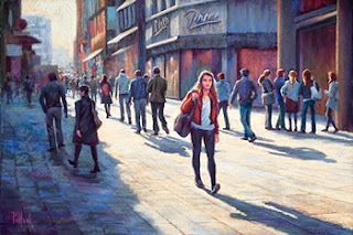
When I first began my art career, I would get so excited about the things I saw that I couldn’t wait to start painting them. Problem was, however, that I’d often get to the middle of a piece and then get lost. And then, I shall neither confirm nor deny, there was a temper tantrum and the whole piece ended up in the proverbial “vertical file.”
I finally cured myself of this irrational exuberance (thank you for that priceless phrase, Mr. Greenspan) by disciplining myself to do initial studies. This is something that I preach to my students whenever I teach at the Art Alliance of Central Pennsylvania, because I see the same impatience in many of them. It’s understandable. There are so many things out there competing for our attention, and it’s only natural to want to rush home to one’s studio and dive right in.

A peek into one of my sketchbooks showing an initial black and white value study for Against the Tide
But over the years, these initial studies have really helped me to strengthen my compositional skills and to understand WHY I am choosing a particular subject. And the studies don’t have to be any massive investment of time. As you can see here, quick, perfunctory sketches are sometimes all that’s required to get a concept imprinted into one’s mind.

A final iteration of the value study where I refined and finalized the concept in my mind’s eye.
These black and white value studies are always part of my initial planning for any piece. For these value studies, I use broad-tipped markers in varying shades of grey. Prismacolor makes a good line of products for this purpose, but if you order a set, make sure you test the markers upon arrival to verify that they are not dried out from too much time on the shelf.
Against the Tide”
20 x 30 pastel
If I need more rehearsal, then I’ll also do some simple color studies. I omitted that step for this piece, Against the Tide, because for me this was all about the light and dark value contrasts throughout the composition. The color was ancillary. Indeed, if you look carefully here, you may see the same thing that I saw, which is a somewhat off-balance 2×2 checkerboard of light and dark values, beginning with a light value in the upper left quadrant of the composition, counterbalanced by light in the lower right quadrant. It’s these types of patterns that help simplify what can otherwise be an overwhelming subject.

