Showing posts with label Philadelphia. Show all posts

Monday, February 22, 2021

Mix and Match

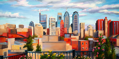
Twilight Skyline
 The Philadelphia Skyline at twilight

Winter is the time of year when I concentrate on client commissions. When I first began working as a full-time artist, I accepted painting commissions for many different subjects including dog portraits. I am a dog person, after all. 

As time went on, I became more selective about what I would paint for clients because I realized a couple of things. First, there were just some subjects for which I was not well suited, such as portraiture (alas, I don't know how to magically take ten years and fifteen pounds off of someone). Secondly, although I like to believe that I can paint pretty much any subject, I recognized that I could do much better work for someone if the subject naturally resonated with me and fell within my usual interest of either a landscape or a cityscape painting.

Daylight Skyline
  The Philadelphia Skyline in summer daylight

This winter, one of the commission ideas I'm most excited about is a skyline view of the city of Philadelphia as seen from my client's rooftop garden. When he and I initially spoke about his idea for this painting, we bonded over a shared history and continuing interest in flowers and gardening. A subject like this is fun for me because it combines a cityscape subject with hints of the natural landscape, including the beautiful sky and the foreground flowers. 

Shown here are two of my initial studies for my client based on the reference material he provided to me. When I work with clients on custom paintings, I like to give them initial studies to review so that we have a good starting point when considering what we want to emphasize in their painting. There's no substitute for the old adage that, "A picture is worth a thousand words." I've found that initial studies help to show the client what I'm thinking. They represent a visual starting point and help my client to discuss desired adjustments and changes before I dive into the final painting. 

In this instance, upon review of these two studies, my client and I decided to go with the more dramatic "twilight" study, but to incorporate a couple of compositional details from the daylight study. Sometimes this selective "mix and match" is what it takes to arrive at the best presentation for my client, and I'm happy when we can draw traits from both studies to make the best possible artwork. 

If you'd like to commission me for a custom oil painting, please contact me!

Monday, January 18, 2021

Back to Black (and white)

 
The Center City skyline of downtown Philadelphia
as viewed from a spectacular urban rooftop garden


I'm listening to AC / DC’s hit "Back in Black" as I write this because it's the perfect theme song for what I’m working on right now. During these winter months when I'm not exhibiting at outdoor art shows (and especially during a time of pandemic), I use this quieter time to work on custom painting commissions for clients.


Among a few projects that I have in process right now is a custom cityscape painting that will feature the Center City skyline of downtown Philadelphia. There are many factors to consider in a subject so complex, everything from light and atmosphere to the details of the architecture. To keep an idea like this from becoming overwhelming, I go back to basics and go "back to black." Gosh, it's almost a perfect title to pair with AC / DC, right? 


An alternative perspective of the subject  
 
What I mean by this is that I strip down the idea to graphite renderings in my sketchbook to work out the composition and approach. This is just a first building block. In the coming weeks, I’ll do a couple of small scale color studies for my client to review. As the old saying goes, a picture is worth a thousand words, and these first practice runs at an idea allow me to communicate what I’m thinking to my client and also help him offer his thoughts and ideas during the process. 


There’s nothing wrong with going "back to black" to create a full-color painting!

Saturday, May 21, 2016

Shorthand

Uff dah. It's been a while since I posted to this blog. In an era of online social media, we artists have to wear a lot of hats between web sites, blogs, Facebook, Instagram, Twitter, and more. Earlier this year, I finally jumped into the year 2010 by creating an Instagram presence (@sarahpollockstudio) and I've actually been pretty good about keeping that up-to-date. In fact, if you're looking for the first dibs on my new pieces, Instagram is a great way to peek in at what I'm working on in my studio.

Anyways, rather than talking about my art online, I've been making it in my studio. I've been busy getting ready for my first art show of the season, the Rittenhouse Square Fine Art Show in Philadelphia. I'll exhibit my new pastel works at this event during the weekend of June 3-5, 2016, and I recently finished several new pieces in preparation for the show. In this post, I wanted to share a little more with you about the process behind some of these new pieces.

Color motivates my choice of subjects. After more than a decade of working in the pastel medium, I've found a process that allows me to quickly evaluate whether an idea will work successfully. I call it my shorthand, in honor of my Mom who had to learn actual shorthand in high school. Indeed, her first job was as a corporate secretary for a company in Milwaukee, Wisconsin. All these decades later, when she and I go to the Philadelphia Flower Show each spring, I still catch her writing in a small notepad using shorthand as she jots down ideas and inspiration.

Initial Shorthand for "Please Continue to Pull Forward," an eventual 12 x 24 pastel.

Final Piece: Please Continue to Pull Forward, 12 x 24 pastel.

My "shorthand" is a series of small color studies, some of which I've shared here. I learned this approach from Doug Dawson, a wonderful pastel artist and an outstanding teacher. He emphasized the importance of selecting just the most essential colors and values to convey a composition. And then sticking to them for as long as possible. Eliminate the superfluous and stay with the most essential ingredients.

In these initial studies, I think you'll see how just these tiny dabbles of thinking and planning link to the final, polished piece. Enjoy!

Initial Shorthand for "July Coda," an eventual 16 x 24 pastel.

Final Piece: July Coda, 16 x 24 pastel.


Initial Shorthand for "Capture," an eventual 12 x 18 pastel.

Final Piece: Capture, 12 x 18 pastel.

Thursday, September 10, 2015

School is Back in Session

I've been working on several new pastel cityscapes in anticipation of my final art shows later this fall. Shown here are a few new pieces fresh off the easel within this past month, including subjects from Pittsburgh, Philadelphia and New York City.

South Street Rain

South Street Rain 8 x 8 original pastel.
A rainy summer day becomes a play of brilliant abstract color
along South Street in the heart of Philadelphia.

As the temperatures cool down and school resumes, it's worth highlighting that I'll teach a 6-week class for the Art Alliance of Central Pennsylvania in Lemont later this month. The class is called "Forward! Strategies for Strengthening Your Artwork" and it's suitable for both beginning and intermediate students in all 2D media.

I tailor this class to the interests of my students while we work on topics such as overcoming common creative roadblocks, choosing subjects, gathering strong source material, and resolving the challenges of color and composition. I pull materials from my background as an artist for Walt Disney Feature Animation, TED Talks, contemporary artists and my experience as a full time artist to help students set up their work spaces and focus in on the things that they want to address in their artwork as they move forward. The class will be held on Wednesday afternoons from 1-4pm beginning on September 30, 2015. Here's the full class description:

Ever feel stuck in a rut? Want to take your art to the next level?

Learn from a national award-winning fine artist and Walt Disney Feature Animation alum how to overcome the roadblocks, habits and fears that inhibit creating great art. We’ll cover topics including how to identify promising subjects; how to gather source material; overcoming the challenges of color, values and composition; what to do when you feel stuck; and how to effectively organize your workspace. This class is open to beginning and intermediate students who work in all 2-D media: acrylic, oils, watercolors, pastel, and drawing. The class will be tailored to the interests of participants. On the first day, please bring a sketchbook and your favorite drawing utensil.

For more information about this class and to register, please contact the Art Alliance of Central Pennsylvania by phone at (814) 234-2740 or through their web site: www.artalliancepa.org.

Dynamo 18 x 18 original pastel.
A view from the High Line Park in Lower Manhattan.

Wednesday, April 01, 2015

New Cityscapes in Oil

It's been a long, cold winter. But it's also been a very productive time for me. When the snow is falling, the wind is howling, and the conditions are too rough for working outdoors, there's nothing that I enjoy more than taking a mug of hot tea into my studio and focusing in on larger scale works. It's a great time for me to concentrate without the distractions of working outside in my garden or wanting to be out on my bike.

Night on the Town 16 x 16 oil on panel

As we get into April, there is still a light cover a snow on our property (no fooling!), but it's going to warm up soon and this seems like a good time to pause and take inventory of what this past winter yielded. I'd like to introduce you to a few new cityscapes. The first is "Night on the Town," a new piece from Center City in Philadelphia. I like the juicy color in this work, and I had a lot of fun with the loose brush work to depict the distant, down-the-street horizon. If my memory serves me correctly, this was along 15th Street near Walnut.

Behold! 30 x 30 oil on panel

The second work is "Behold!" This piece continues my fascination with storefront displays, and the inspiration for this motif came from a gorgeous holiday display in midtown Manhattan. I'm captivated by how people, so rushed and so entranced by their cell phones, interact with these displays as they go walking past. I suspect that the job of a window display designer has gotten very tough over the past decade with the explosion of cell phones. I know as an artist that it is harder and harder to capture attention. But this particular design and the way in which passers by interacted with it definitely caught my eye. I loved the brilliant colors and angles.

Paris Twilight 12 x 24 oil on panel

Finally, I have "Paris Twilight," a celebration of the narrow, winding corridors that make up some of the oldest neighborhoods in the heart of Paris, France. In this piece, I experimented a bit with leaving some passages loose and more colorful. You will see more pieces that employ this approach in my future works because I enjoyed letting the medium speak for itself within these areas. The optical mixing of color, in which the artist lets the viewer's eyes do the work, is intriguing to me.

I hope you enjoy these works. If you happen to be in State College, Pennsylvania at any point between now and the end of May, you can see these new works in my "Jewel Tones" exhibition at the Mount Nittany Medical Center. For more information, please contact me. Enjoy!